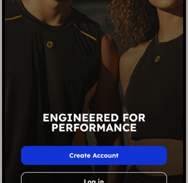
Engineered For Performance: Mobile E-commerce Experience
Redefining how athletes shop for performance wear. A comprehensive design sprint focusing on streamlining the checkout flow and enhancing product discovery for high-performance athletic gear.


01 - The Challenge
Problem Statement
Why existing gymwear apps fail the serious athlete.
Users struggle to find technical specifications for gym clothing on mobile devices. The current market solutions prioritize lifestyle imagery over product data, leading to high return rates and user frustration. The "serious athlete" persona needs precision, not just inspiration.


Goals & Objectives
02 - Goals
The primary mission was to redefine the mobile shopping experience for fitness enthusiasts. By focusing on friction-free navigation and crystal-clear product data, we aimed to bridge the gap between browsing and buying.

03 - Target Audience
Target User:
The 'Efficient Explorer'
Understanding the core persona requirements, lifestyle patterns and shopping behavior.


04 - Information Architecture
Information Architecture
Created a streamlined navigation structure for the EFP Mobile app. The goal was to reduce friction between discovery and checkout by organizing content and ensuring an easy, fast checkout process.

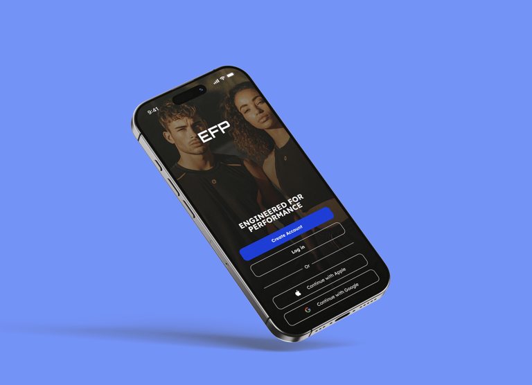
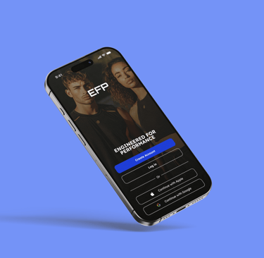
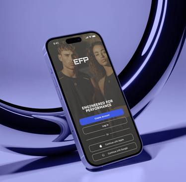
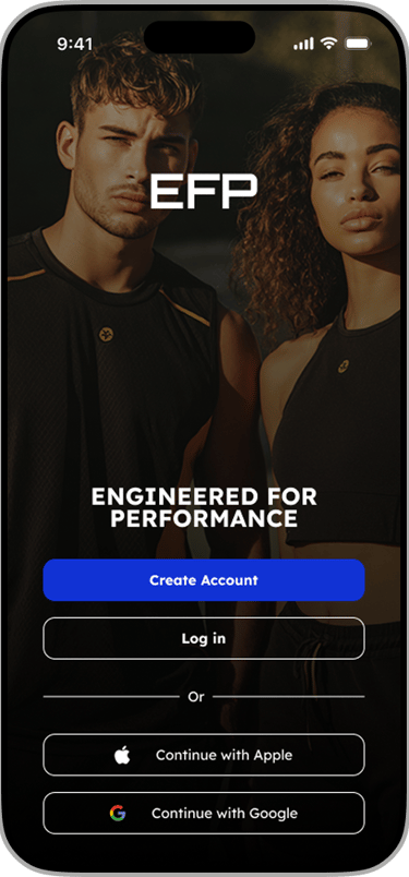
05 - Authentication Flow
Reducing friction at the entry point
The login experience focuses on speed. By prioritizing social auth and keeping the form fields large and accessible, we ensure users get to the shopping experience as fast as possible. The design leverages biometric familiarity and clearly separated actions.
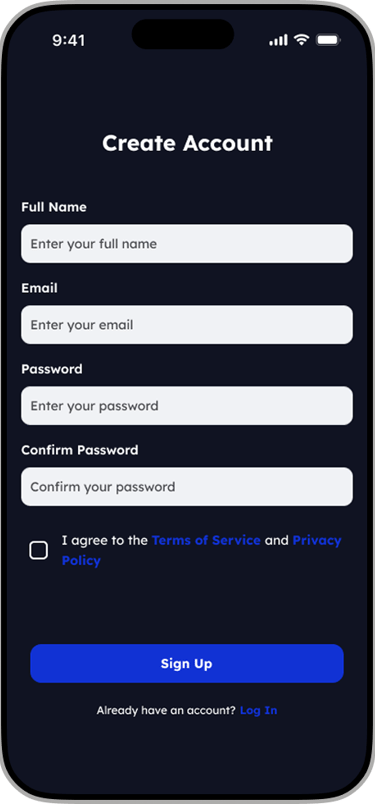
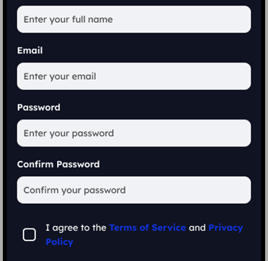
Seamless Sign-Up Experience
Designing a sign-up flow that balances security with speed. Implemented real-time email verification and social login options for more successful account creations
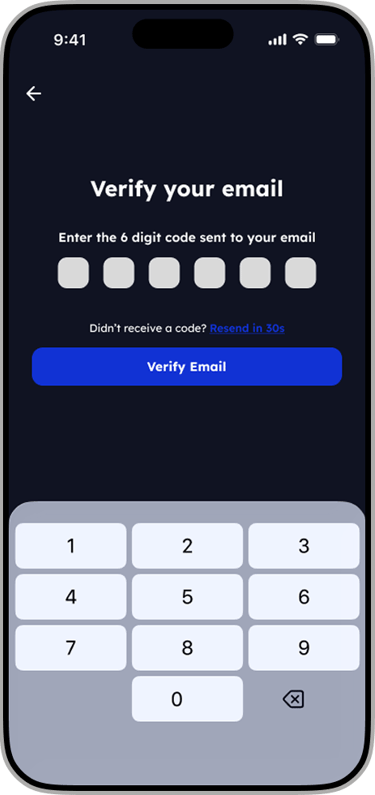
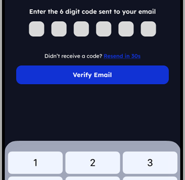
Secure Email Verification
Designed a friction-free verification process. By using auto-focus on the first field and a numeric keyboard default, we ensure the onboarding continues smoothly without any hesitation for the end user.
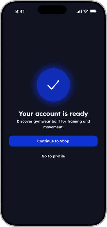
Success State
Optimizing the account creation experience to create immediate engagement.
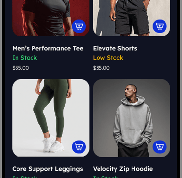
06 - Product Discovery
Product Discovery
The product discovery experience was designed to help users quickly find relevant training apparel with minimal friction. Navigation prioritizes clarity, speed, and performance-driven browsing, allowing users to explore collections based on gender, new releases, and promotions in just a few taps.
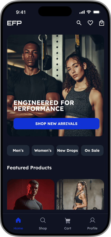
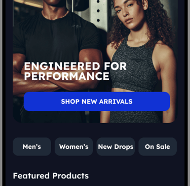
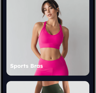
The home screen acts as a performance-led entry point, highlighting key collections, featured products, and new drops to immediately engage users and guide exploration.
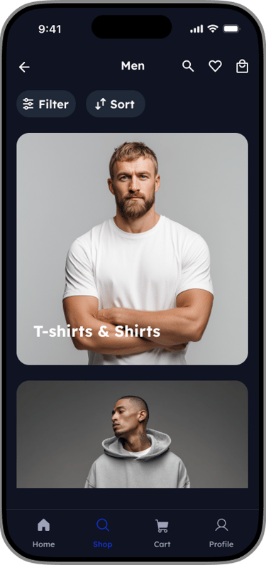
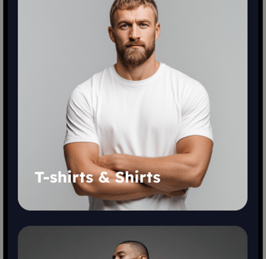
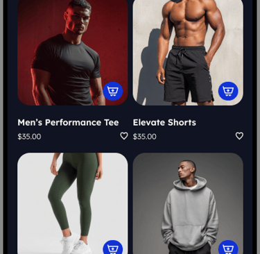
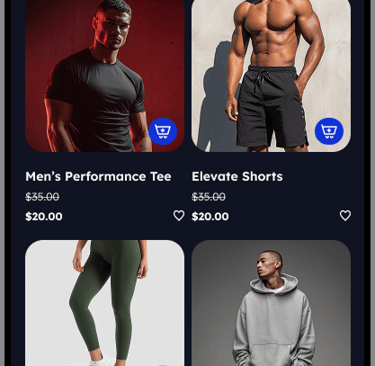
Men's Clothing
The Men’s section presents categorized training apparel with filter and sort overlays that enable users to narrow options by product type, size, and price.
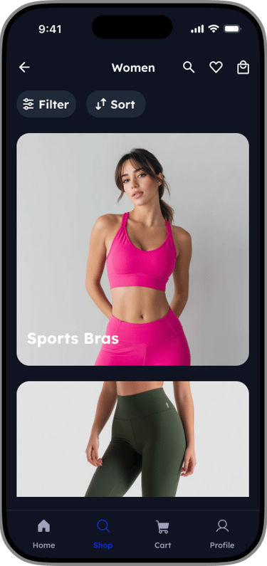
Women's Clothing
The Women’s section mirrors the men’s experience, using the same filter and sort overlays to ensure a consistent and intuitive browsing experience.
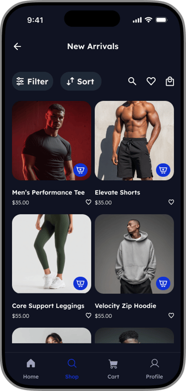
New Drops
New Drops highlights the latest releases, with sorting options that allow users to view new arrivals based on relevance or price.
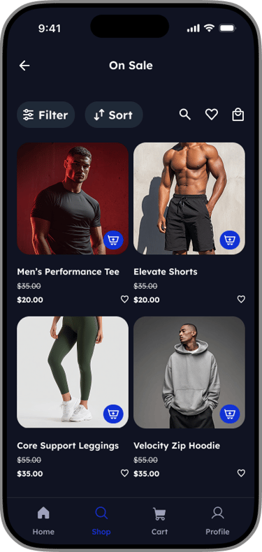
On Sale
The On Sale section surfaces discounted products, supported by filters that help users quickly find the best deals in their size or preferred category.
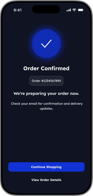
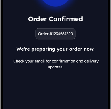
07- Checkout Flow
EFP Checkout Experience
A frictionless mobile purchase journey for high-performance gear. Focusing on transparency and speed to minimize cart abandonment
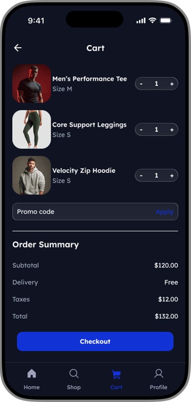
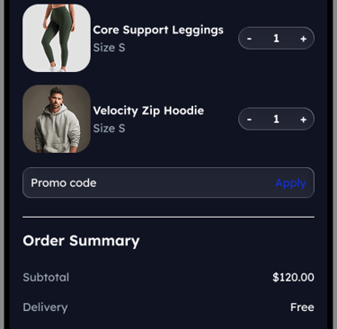

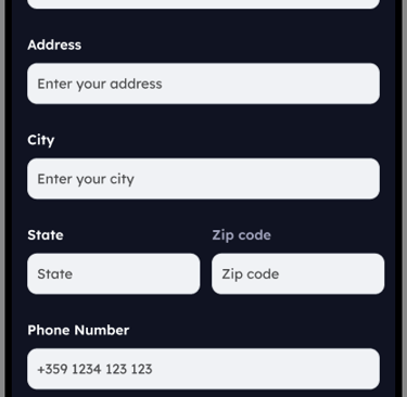
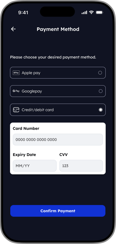
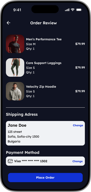
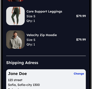
Persistent order summary
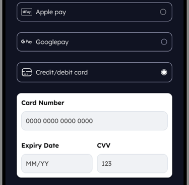
Users can review items and pricing increasing confidence before payment.Minimal form inputs
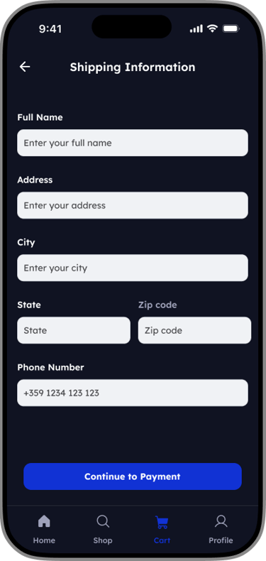
Only essential information is requested to keep checkout fast and friction-free.Clear primary actions
Each screen has one dominant CTA to guide users forward without distraction.
Key UX Decisions
07- Post Purchase Experience
Streamlining the post-purchase experience
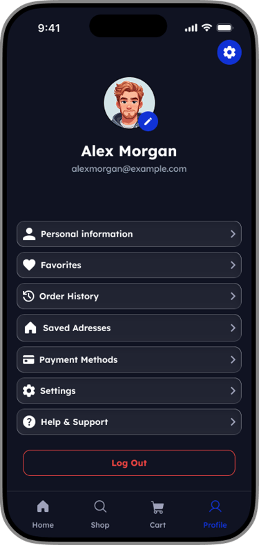
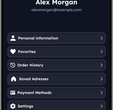
The Profile screen was designed as a centralized hub where users can manage their personal details, preferences, and orders with minimal cognitive load. The layout prioritizes clarity and accessibility, allowing users to complete common account-related tasks quickly and confidently.
A clear visual hierarchy places user identity at the top of the screen, reinforcing personalization, while grouped navigation items make it easy to scan and access key actions. Frequently used features such as order history, saved addresses, and payment methods are surfaced prominently to support repeat purchases.
Settings and support options are intentionally placed lower in the list to reduce clutter while remaining easily accessible. A distinct logout action is visually separated to prevent accidental taps and reinforce user control.
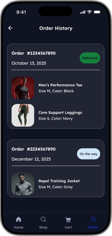
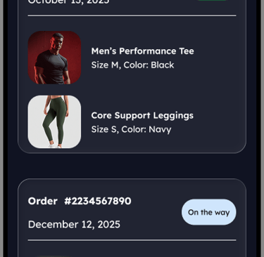
Order History
The Order History screen was designed to give users a clear and reliable overview of their past and active orders. Orders are displayed as individual cards, allowing users to quickly scan key details such as order status, date, and total at a glance.
Prominent status labels (e.g. Delivered, On the way) provide immediate feedback on order progress, reducing uncertainty and the need for additional support. Active and completed orders are visually distinguished to help users prioritize what matters most.
This card-based layout supports fast recognition, easy tap targets, and future scalability, enabling users to track, revisit, or reorder items with minimal effort.
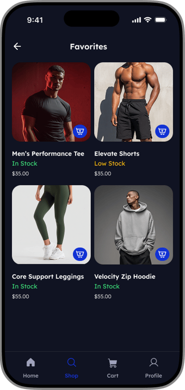
Path to purchase
Designed the wishlist experience to reduce friction between saving an item and buying it. The favorites list allows user to check live stock levels and move items to their cart without leaving the page.

08- Failure & Error States
Payment Failed Error State
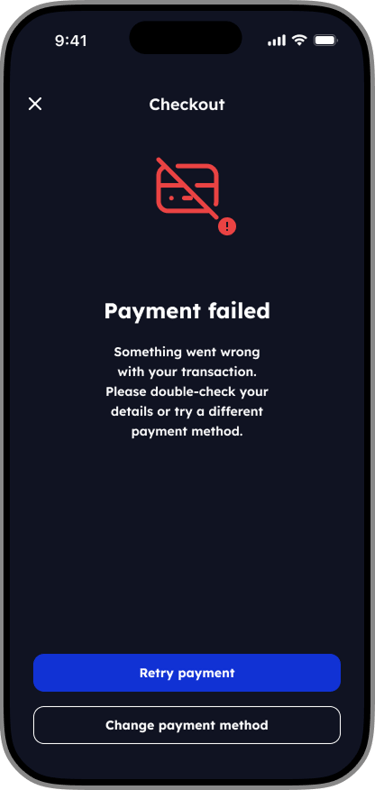
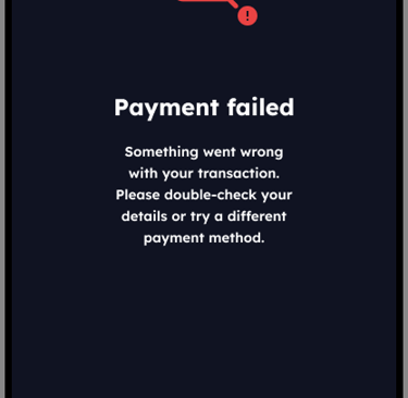
The checkout error state was designed to reduce frustration and prevent abandonment when a payment fails. Clear, neutral messaging reassures users that their order has not been lost, while avoiding technical or blame-focused language.
Actionable next steps are presented immediately, allowing users to either retry the payment or switch payment methods without leaving the checkout flow. By limiting choices to two clear actions, the design helps users recover quickly and continue their purchase with minimal friction.
This approach prioritizes transparency, user control, and confidence at a critical moment in the purchasing journey.
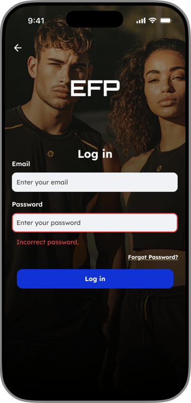
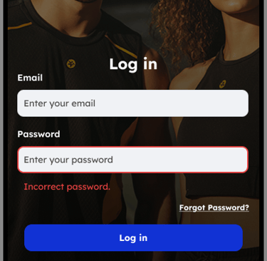
Login Error State
The design utilizes a high-contrast red border combined with a specific text alert to instantly inform the user of the credential mismatch, while keeping the recovery path accessible.

Designing the Empty Cart State
Turning dead ends into opportunities. How I used illustration and clear copy to reduce drop-off and increase conversions.
Empty Favorites State
The empty favorites state was designed to encourage product saving without adding friction. Clear, instructional messaging helps users understand the value of favorites while subtly guiding them toward future intent and repeat visits.

09- Design System
Visual Identity System
A consistent design system was created to ensure visual cohesion and scalability across the app. Reusable components, standardized spacing, and shared typography and color styles help maintain consistency, speed up design iterations, and support a seamless user experience.


10 - Final Outcome
What did this design achieve?
This project resulted in a cohesive, mobile-first gym apparel experience designed for high-intent users. The final solution focuses on fast product discovery, reduced friction across key flows, and clear system feedback through supportive empty and error states.
By applying a consistent design system and performance-driven UI decisions, the app enables users to browse, purchase, and manage orders with confidence. This case study highlights my ability to design scalable systems, prioritize usability, and translate user needs into clear, practical solutions.